MediaConch now has a logo!
MediaConch now has a logo! Its absence was growing larger and heavier with each release that borrows the MediaInfo logo or relies on a shell emoji.
MediaConch’s sibling software projects under PREFORMA, DPF Manager and veraPDF, have had beautiful logos since the beginning.


Below, MediaConch team member Ashley will discuss the development process for the MediaConch logo design.
In my head, I had an idea of what I thought would be a good fit for the MediaConch logo. MediaInfo... but softer. MediaInfo... but shellier! Easy, right? Yes and no. The concept and general feelings for logo design were easy. Concepts for logos don’t always come easy. Sometimes it takes days or even weeks of spinning wheels before the right spark of inspiration occurs. But when it does, it is done. but implementing it was a bit harder because this could be manifested in a myriad of ways. In short, though, the problem: MediaConch should be like MediaInfo, but curvier (like a shell). Curves are a lot harder to create in a natural-looking way.
I always design logos in black-and-white first and add color later. Since MediaConch is the continuation of a brand, it was a relief that the colors that would go into the logo were already chosen. Because of this restriction and the thematic restrictions, it cut down a lot on potential development time through implementation of restrictions. Sometimes restrictions are necessary to narrow down good designs.
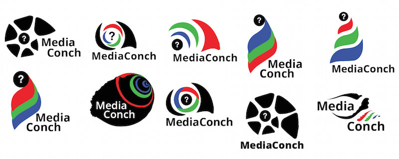
Here are drafts of the first few hypothetical logo designs. I anticipated that these could ALL be rejected and I’d have to come up with another eight. Sometimes that’s just how it goes.

Most of the above went to the MediaConch team leads for a small, casual vote in which a few were selected to move to the next round. (This above example features a few variations that never made it to the next round because they were created during the upcoming process).
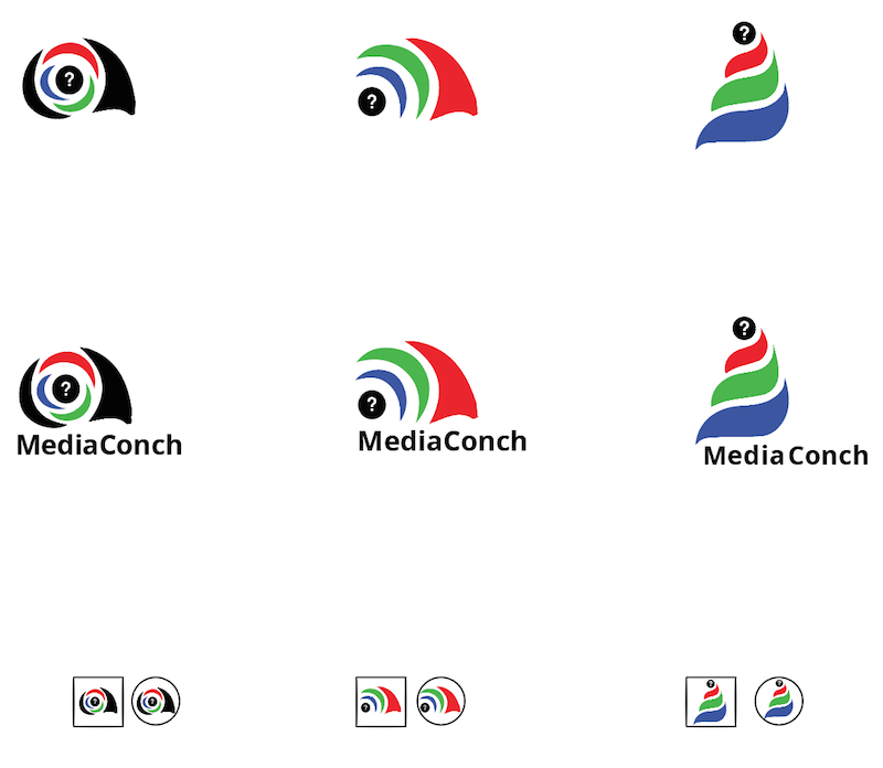
Voting occurred, and the winners were selected from this batch. These got touched up a little bit and examples of how the logo will look with and without logo were created, as well as how each logo will look even when very tiny or even when limited to a circle.

In general, logos spend a lot of time getting tossed around. Sometimes they are very big, sometimes they are very small. Sometimes they have text and sometimes they don’t. For the MediaConch logo, it will likely be viewed most frequently as a Mac dock icon, a Unix/Windows taskbar, or web favicon. Therefore, the logo must look great even when very, very tiny.
Because of this, the first logo above was eliminated. Even modifications on the theme (Figure 1 shows one example of a circular three-color inside-component) resulted in too-blurry results when minimized to a 16x16 pixel or 32x32 pixel size.
This left the two options on the right. I preferred the symmetry in the logo on the right, but the one in the middle was overall preferred. And, in retrospect, I am very glad. It’s difficult to make the best decision when you are also the one creating the options, unless there is time to be able to step away from the designs and see them with fresh eyes.
The middle logo candidate then made it to the final round. Because the above selections are just mockups, it means this logo then has to go through a process of modification and selection just like with the competing designs. This round can be even more difficult than picking from many different potential logos, because the differences are more subtle and the significance is greater: the selected logo will be the final logo, and all other graphics will be based on these shapes.

This process might typically also go through rounds of judging, but I was confident enough to pick the best variation of the logo. This entire selection process prior to this happened quickly, only a few hours, so after spending some time working on the adjustment of curves in the shell-like logo shape, I went to bed in order to be able to give a fresh review in the morning. In the morning, it was obvious that the middle shape was the most suiting. The one on the right looked closest to the original mockup but was a little too tall. The one on the left looked too much like a hurricane and a bit lumpy. The one in the middle was just right!
So with a few more modifications of the curves (again -- curves are deceptively hard!), a final logo emerged.
![]()
Typeface selection and kerning naturally fell into place afterwards (ensuring the capital C in Conch falls within the same curvature as the closing red portion of the “shell”, that the M of Media is centered under the question-mark-ball symbol carried over from the MediaInfo logo). The restriction with typefaces is that it had to be a typeface that was appropriate open source, to follow not only the guidelines of PREFORMA but the ethos of MediaArea. Because of this, I settled on Open Sans, which is licensed under Apache.
As a bonus, I later realized that the logo fit into a design pattern that I hadn’t even thought of when working on it (or the other contenders).

The golden ratio! That which is a scientifically perfect and pleasing shape! Also known as a fibonacci spiral. This is a logarithmic spiral based on the Fibonacci sequence, a sequence of numbers that increment in size. It’s a pattern commonly found in nature, including including conch shells. An ideal fit for a video file conformance checker!